Case study - Web · Cultural non-profit
A site that looks like the paintings, not the template
A from-scratch redesign for Výtvarníci Českého ráje, a volunteer association of 30+ painters in northern Bohemia. The old site made their work look generic and their exhibitions impossible to date-check. The new one is a filterable gallery and a self-updating exhibition calendar - built to stay accurate with minimal maintenance.
Overview
01
Context
No budget, no developer, no design resource - and one shared public surface.
Výtvarníci Českého ráje is a volunteer association of more than thirty painters around Turnov, in the Bohemian Paradise region. Members exhibit locally and in Prague and sell original work directly to visitors. The website is the only shared, public-facing surface the group has - with no marketing budget, no in-house developer, and no design resource beyond what members contribute themselves.
I'm part of this community - I take painting classes with the founding member - and offered the redesign as a professional favour, bringing the process I use day to day to a group that would otherwise never have access to it.
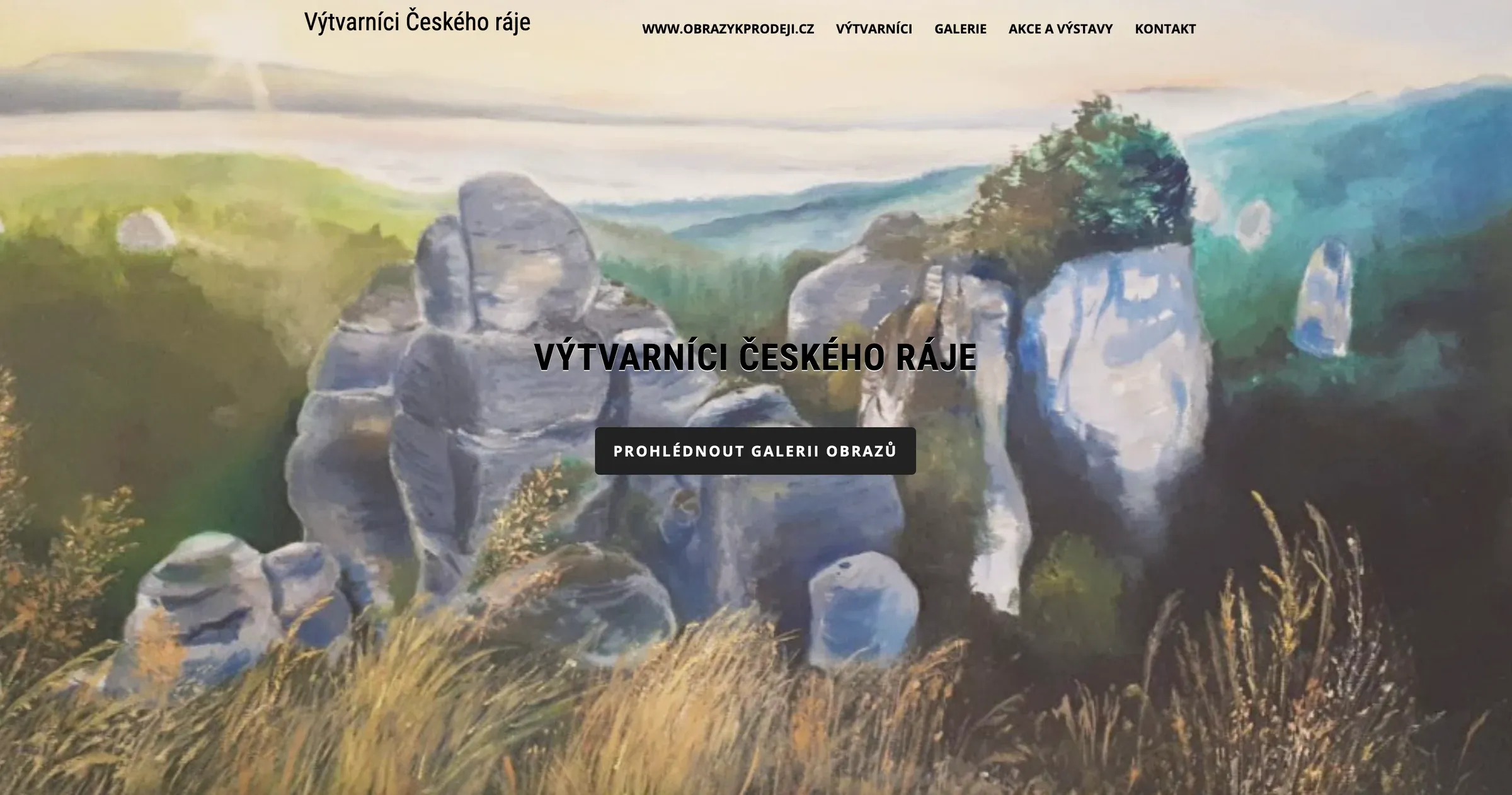
The existing site was a barebones WordPress build: functional, visually flat, structurally minimal. No way to browse the collective's body of work, and no signal of which exhibitions were still running. For a group whose entire value proposition is the work itself, the site undersold it.
The site should look like the paintings, not like a template.
02
The problem
The site had one job it wasn't doing: helping people discover and connect with the work.
Whether that meant finding an exhibition worth visiting this weekend, browsing paintings in a style or size that might suit a buyer's home, or simply understanding who the thirty-odd member painters were and what they made. Left unsolved, it meant missed foot traffic to physical shows and missed sales inquiries - the two things that matter most to a self-funded volunteer association.
03
Constraints
Discovery
04
Research
A focus group with 12 of the ~30 members, plus a structural review of the old site.
Two methods, deliberately paired: the sessions surfaced what members wanted to say about their own work, the review showed what the site was failing to do mechanically. Recurring themes:
05
Defining the problem
Three jobs the old site never attempted.
Make it obvious which exhibitions are happening now, and where
Let visitors browse and filter the actual body of work, not scroll a flat list
Surface which paintings are for sale - without an e-commerce system nobody could maintain
A minimal, neutral portfolio aesthetic would have undersold the exact thing the association exists to showcase: expressive, hand-made work. The visual system had to carry some of that warmth without costing usability.
Design
06
Designing for zero maintenance
With no engineering resource beyond myself, every decision was made against long-term maintainability rather than initial polish.
Exhibition status, derived rather than tagged
Early explorations tagged each exhibition manually as current or past - which meant someone remembering to update the site every time a show opened or closed. Unrealistic for a volunteer group. I moved to a date-driven model: each exhibition carries a start and end date, and its status - upcoming, running, ending soon, archived - is derived automatically. The site stays accurate without anyone touching it after a show is entered once.
How much filtering to expose
Artist, technique, size and for-sale status - weighed against the risk of over-complicating a simple browse. All filtering runs client-side with no backend, combining with AND logic, which kept it fast and kept the build inside a static-site budget.
Apricot and violet, chosen on purpose
I moved off an initial, more neutral palette toward a bolder apricot-and-violet pairing - to separate the collective from other regional art-association sites and to evoke the warmth and colour of painting itself rather than an institutional feel.
Working with the stakeholder
I checked in periodically with the founding member, using her as a proxy for the membership's priorities and a sanity check on whether the direction still felt authentic to how the group sees itself. Closer to an ongoing conversation than formal stakeholder reviews.
Why no CMS, on purpose
A dependency-free static HTML/CSS/JS build, deliberately avoiding a framework, so the prototype can be handed off, hosted anywhere, and maintained without specialist knowledge. The right trade-off for an all-volunteer organisation - even though it meant hand-authoring content that would normally live in a database.
Solution
07
Landing page
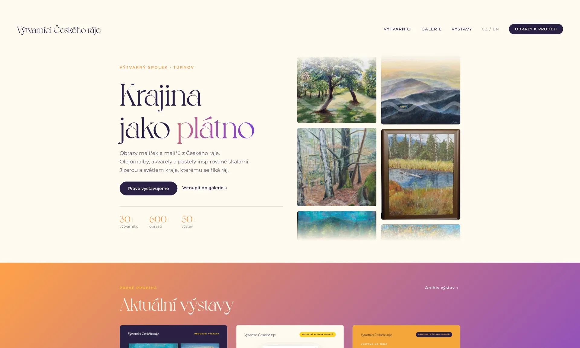
A hero introducing the collective, a marquee of member paintings, the exhibitions running right now, browsable gallery collections, and a preview of the member artists. The work leads; the text follows.
08
Gallery - filterable collage
The screen that does the most work.
A collage of the collective's work, filterable by artist, technique, size and for-sale status, with a full-screen lightbox for individual pieces. Four filters, combined - enough for a buyer's real decision criteria, not enough to turn browsing into a search form.
- Artist
- Technique
- Size
- For sale
09
Exhibitions - status that updates itself
Active shows and an archive of past ones, each status derived from its own dates, plus a poster lightbox for exhibition materials. Nobody has to remember to archive anything.
- Upcoming
- Running
- Ending soon
- Archived
10
Try the prototype
Filter the gallery, open a painting, check what's running this month.
Impact
Outcomes & impact
The redesign is a completed high-fidelity prototype, not yet deployed in place of the live WordPress site. Handoff and launch depend on the association finding someone to host and maintain it - a real constraint of working with an all-volunteer organisation rather than a company with a dev team.
11
Reflection
12